
Bitesize replatformed for a simpler, smarter design
The BBC was in the process of migrating it’s Web products to a new single tech platform & design system (WebCore). Bitesize was required to migrate 1000s of Index & Article pages that had been curated and essentially designed by Editorial teams.
Role
Lead product designer
Employer
BBC
Areas
Strategy, design, stakeholder management
Platform
Web (Responsive)

Bitesize’s newly migrated website
The problem
Migration would allow us to be more cost effective and importantly; test, learn and iterate quickly in order to provide more consistent & relevant user experiences.
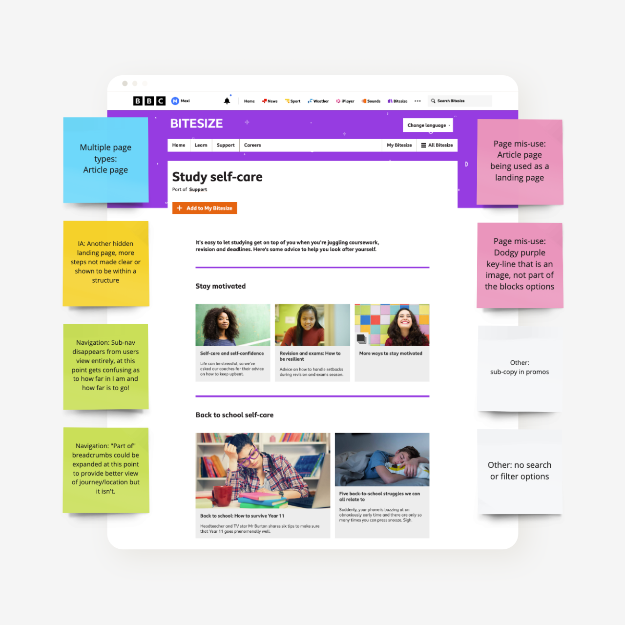
The problem was Bitesize’s site architecture. Over time, it had out grown the product’s navigation, creating multiple routes to content, duplication and poor sign posting. All of these issue contributed to a poor user experience.
The challenge was to provide a new architecture and relevant user journeys to content while securing buy-in from Editorial stakeholders who would ultimately maintain the site’s architecture.
Key metrics
Improve site performance & accessibility
Maintain SEO performance
Constraints
Deadline for switching off existing tech platforms
New, evolving design system & CMS tools
No user research and poor available data
My process
Identifying the problems
The discovery phase was used to identify the scope of the project and identify any opportunity to improve while migrating. Analysing any existing data, previous design decisions and establishing relationships with multiple stakeholders.
A site audit was carried out to establish the scale of any issues we faced. This documented problems with Navigation, Sign-posting, Component mis-use to name a few. The audit was shared early with Product and Editorial stakeholders to highlight the issues and also provide me with context behind some of the previous decisions. This was a hugely valuable step as it ensured buy-in from all stakeholders very early in the process.
By sharing the audit findings early, I was able to establish relationships quickly with senior stakeholders. This step in the process also provided the Editorial team with the time to then consider the content and how it should be re-structured when migrating.
Data highlights
50% of users arrived at content directly from search
High SEO performance of content
An example of the site audit conducted to gauge the problems we faced
Bitesize’s previous iteration of index pages, using article page templates to outgrow the product navigation
Reframing the problems
Having now clearly outlined the business and user problems, I chose to reframe them into opportunities using the How Might We process. This design thinking technique allowed me to quickly write positive, open questions that would provide the stimulus for solution ideation.
The reason I chose this method was it would allow me to move quickly and consider several solutions before committing to visual designing anything. It also enabled me to work in the open and share my thinking with other disciplines, using a feasibility matrix to realistically prioritise the solutions.
The last process used in the Define phase was a feasibility matrix. I facilitated a session for senior stakeholders to discuss and prioritise the potential solutions. Continuing to work openly enabled me us as a team to share knowledge quickly. It also meant that the solutions we chose to progress maintained both business and user focus.
The outcome of this session also shaped our product road map, allowing us to begin planning our delivery efficiently.
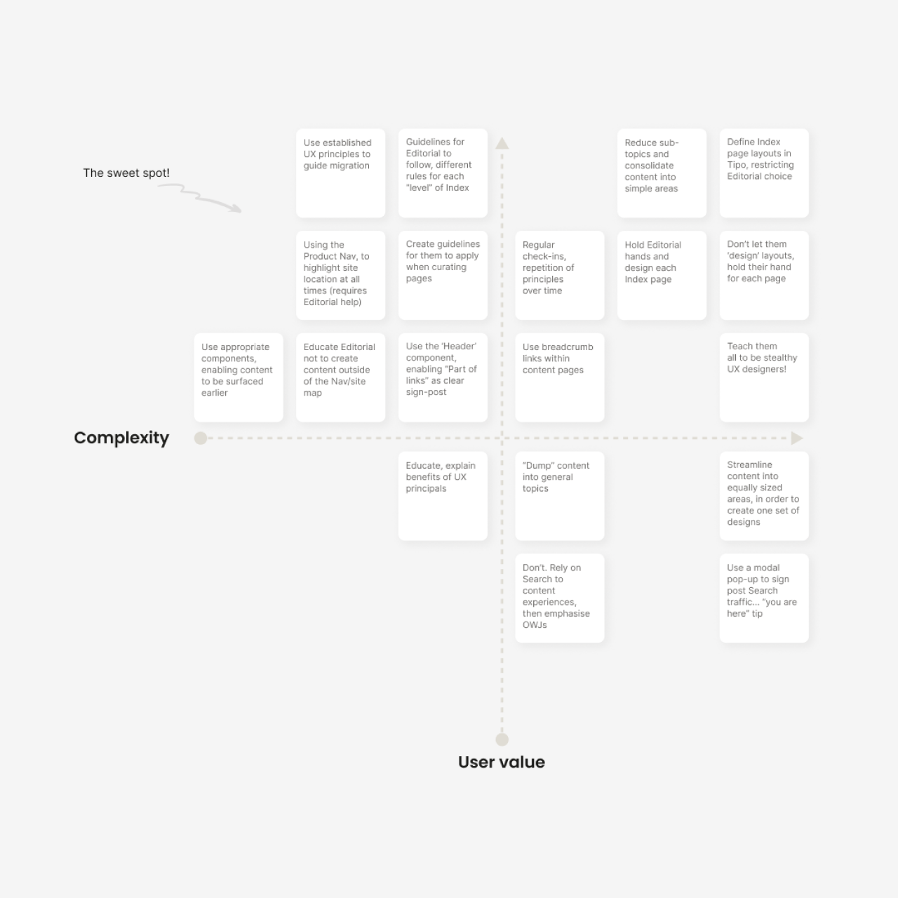
A feasibility matrix was used to organise potential solutions
Clear sign posting for users
Due to time pressure created by sunsetting deadlines, user research wasn’t possible and the previous website wasn’t tracked for data. This unfortunately meant we had no strong user insights to base design decisions on.
In the absence of insights, I focused on established UX design principles, improving the experience with methods and patterns commonly used and regarded as standard within the industry. Once launched, we could validate the design decisions and iterate, making Bitesize more relevant to users.
We knew that certain problems like accessibility, poor data and page type mis-use would automatically be improved simply by migrating to the BBC’s new WebCore platform. With that in mind I focused on the sign posting problem.
Knowing 50% of user arrived directly to content from search meant it was important we provided users with clear sign posting of where they had arrived. This was important to avoid bounce rates and enable users to continue onward journeys within the Bitesize product.
To do this we adopted a shared Header component across all content that would allow us to consistently input headings, data and tags. This data would provide users with context of where they where in the site structure upon arrival from search.
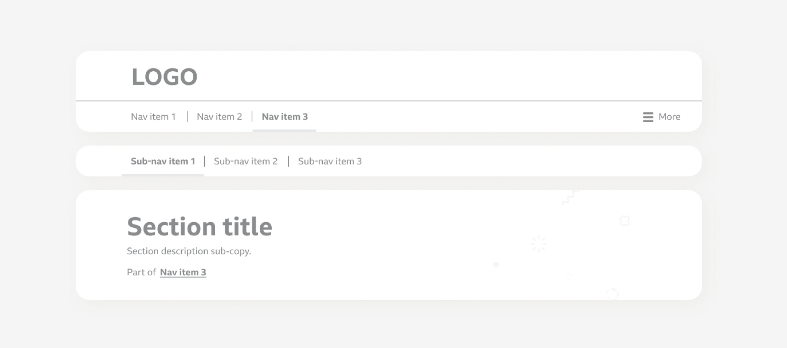
Lo-fi wireframes enabled me to illustrate how using UI components from the new design system would allow us to improve sign posting
Building strong foundations
Having highlighted site architecture issues early, the Editorial team where now in a place where they had a streamlined site map that we could implement.
A big problem identified in Discovery was the lack of visual hierarchy and consistently caused by using article page templates as index pages, meaning suitable components were not available.
The design challenge here was to create a consistent user experience across multiple index page levels without having to design each individual page.
Again, in the absence of user insights, I focused on established UX principles such as the law of common region (gestalt), Jakob’s law and choice overload.
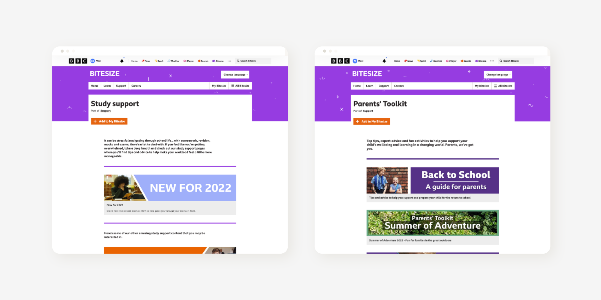
My solution was to develop a series of templates for 3 levels of index page, the levels would accommodate subjects, topics and sub-topics. Different variations of visual hierarchy would be applied to each in order to provide consistency to the site architecture. I collaborated with Editorial colleagues on the template solutions to ensure it met the requirements of the new site architecture.
A big part of this process was educating and ensuring we had Editorial buy-in as they would be the team required to curate the index pages. This buy-in started in the discovery phase, by making sure they had a voice and input into problems and solutions.
When it came to the delivery of the templates, I presented the Editorial team with a set of guidelines on each page type, explaining design decisions and user benefits clearly. We continued to work closely, stress testing the designs and making tweaks to the guidelines when necessary.

Lo-fi wireframes enabled me to quickly present ideas and generate buy-in from stakeholders around UX principles and a template approach
Outcomes
Improved data & tracking
Migrating to the new platform will enable us to record accurate user data and make informed design decisions in the future.
Establishing UX principles
By enabling Editorial colleagues to implement UX principles in their designs, we have hopefully created a user focused outlook in other departments.
Simplifying the platform
Migrating to the new common BBC platform will enable us to test and iterate very quickly in the future, providing a more relevant user experience.

Bitesize’s migrated mobile website
Metrics
The key metrics of site & SEO performance where successfully met. But the real success would be long-term in how the migration would allow Bitesize to quickly respond to user needs in the future by using shared capabilities and improved data.
+2%
Increase to SEO performance; meant users could continue to access Bitesize content via search at key points in their education.
+25%
Increase in page performance & accessibility; provided users with quicker page loading, less errors and a higher standard of accessibility.
Reflections
By leading the UX design for this project, I had the opportunity to learn many things and to continue to improve as a designer.
Transparency; working in the open
By sharing work in progress regularly I was able to align Product & Editorial teams on the problems we faced very early in the project.
Ongoing collaboration with stakeholders
The majority of problems had been caused by a lack of collaboration between teams. Working closer going forward benefits all parties including the users.
User insights should always be prioritised
Sadly this project lacked initial user insights, something we have solved by migrating. It is the basis of all of our work an shouldn’t be overlooked going forward.
Want to see more?
This case study is simply a snapshot of the work. If you would like to hear more about my processes, thinking and the challenges, please get in touch.
More work

Newsround moves to a new platform with a fresh design
