Bitesize rebrand: a new look tailored to users
The BBC as a whole was re-branding across all platforms & mediums. Bitesize’s rebrand would be the biggest change for all of the core services. Initial brand guidelines were light, my goal was to expand the rebrand to digital products, aligning with the wider BBC but also remaining relevant to users.
Role
Lead product designer
Employer
BBC
Areas
Strategy, design, research, stakeholder management
Platform
Web (Responsive)

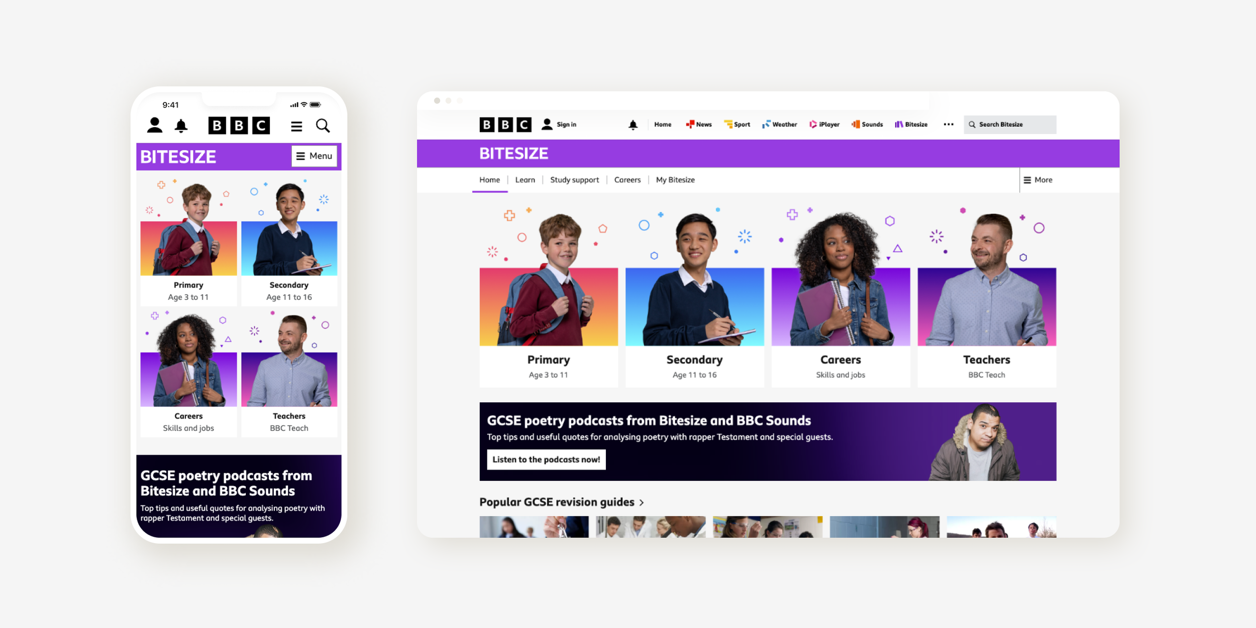
Bitesize’s rebranded homepage
The problem
As the rebrand was focused ont he wider BBC, details of branding for digital products was sparse. This meant UX teams where required to deep dive into how the new branding could be applied and identify any gaps.
Bitesize would also be required to visually change the most under the rebrand, providing a risk to recognition and consistency for users.
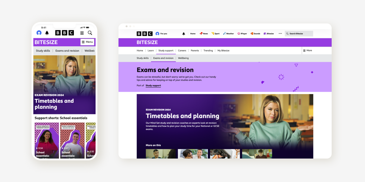
Along side the rebrand, work on tech migration was happening. Meaning I had to consider how the rebrand would be applied to both the old and new platforms.
Key metrics
Improve site performance & accessibility
Maintain SEO performance
Constraints
Brand guidelines not fully evolved
New, maturing design system
Accessibility standards within digital products

Previous Bitesize branding

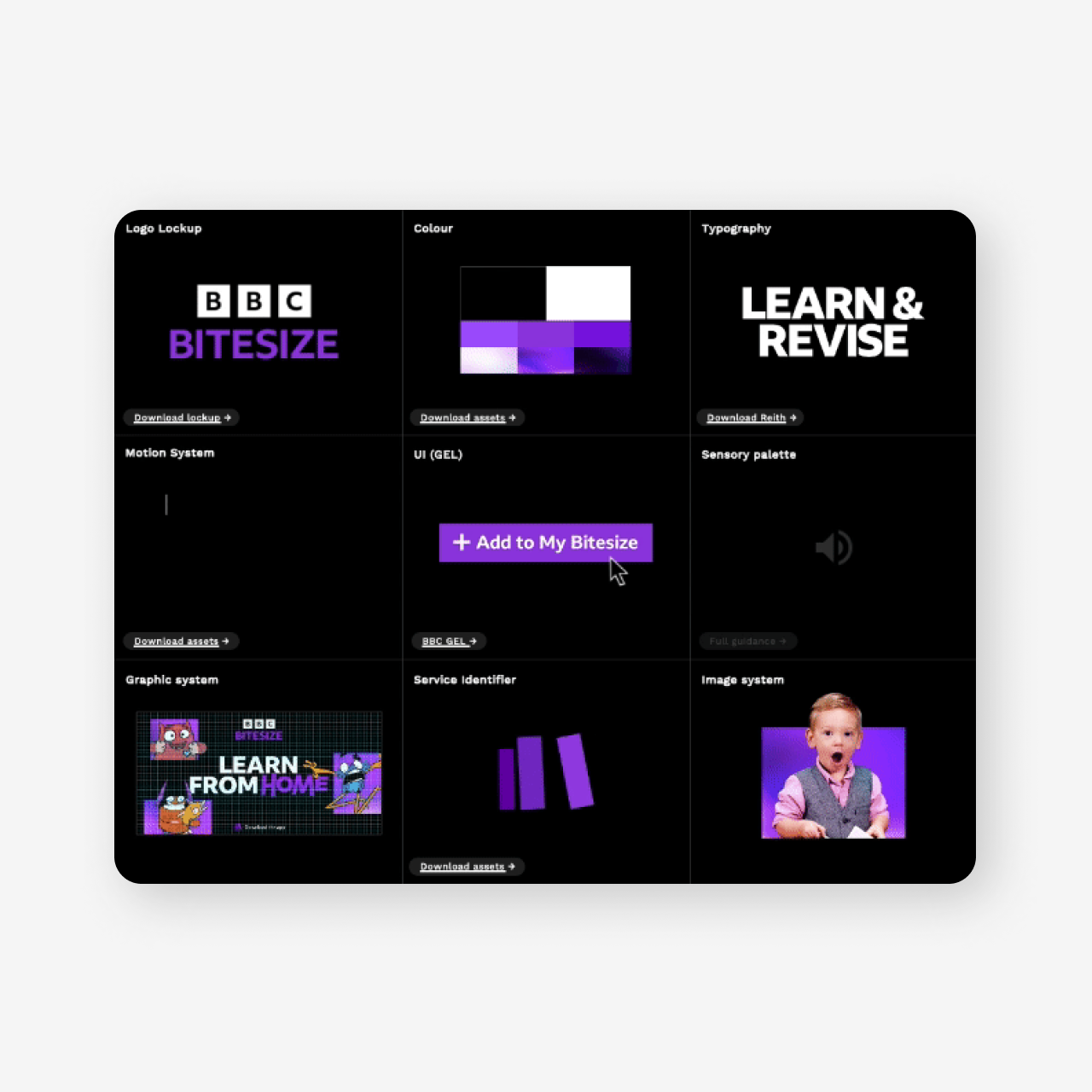
Bitesize’s rebrand guidelines
My process
Visualising the rebrand
As there was such a shift visually, I wanted this project to be user focused from the start and agreed with Product & UX leaders to conduct research into brand perception.
The discovery phase was used to identify the scope of the project, a deep dive into the existing and new branding was carried out to identify problem areas. I also carried out a gap analysis on the new design system to identify any new components that might be required to help us apply the rebrand when migrating in the near future. The output from the deep dive was concepts covering key user journeys that would be the stimulus for the research.
The research findings formed the structure of the project, and a number of briefs were written in response to the user feedback. This process ensured all of the work and decision making would remain user centric throughout.
Research highlights
Overall brand perception was positive
UI concepts well received
Existing brand elements aided recognition
Photography used didn’t resonate with users

Homepage photography concepts, used as part of the user research
Expanding the brand guidelines
Through our deep dive work it was identified that the initial colour palette would need expanding to work for Bitesize’s digital products. This was consolidated by the risk changes would make to users brand recognition.
We evolved the previous palette that included colours for educational phases and aligned it with the new style. Ensuring we provided accessible versions of all colours. I also stress tested the Bitesize ‘light’ colour for accessibility in light & dark modes, making adjustments to the colour in order to improve accessibility and future-proof the branding.
Although these colour changes may seem like minor tweaks, each one had to be shared and agreed with multiple senior stakeholders across departments such as Editorial, Branding & Product and applied through collaboration with multiple UX teams.
We also reintroduced graphical brand elements called ‘sparks’, this was again done to maintain brand recognition. The re-branded ‘sparks’ were simplified to align with the updated branding.

Bitesize’s colour palette was expanded to accommodate user journeys and improve accessibility
A relevant homepage experience
Two of the other briefs written in response to the user feedback focused on the homepage design; UI design & bespoke photography. These two elements would enable Bitesize to really deliver the rebrand, creating a relevant user experience in the process.
Working closely with Marketing colleagues and a third party design agency, we devised an art direction document that would be used to direct the photography shoot. Casting was focused on user feedback, ensuring the models and styling were relatable.
I was then responsible for selecting the appropriate shots that met our guidelines, seeking stakeholder approval in the process.
The photography would form the basis of a new UI component, promoting the various educational phases. Our component designs also used an image treatment that was a core element of the wider BBC rebrand. Meaning once build, other BBC products would have access to this UI through the shared design system, allowing them to also increase the BBC’s brand presence.
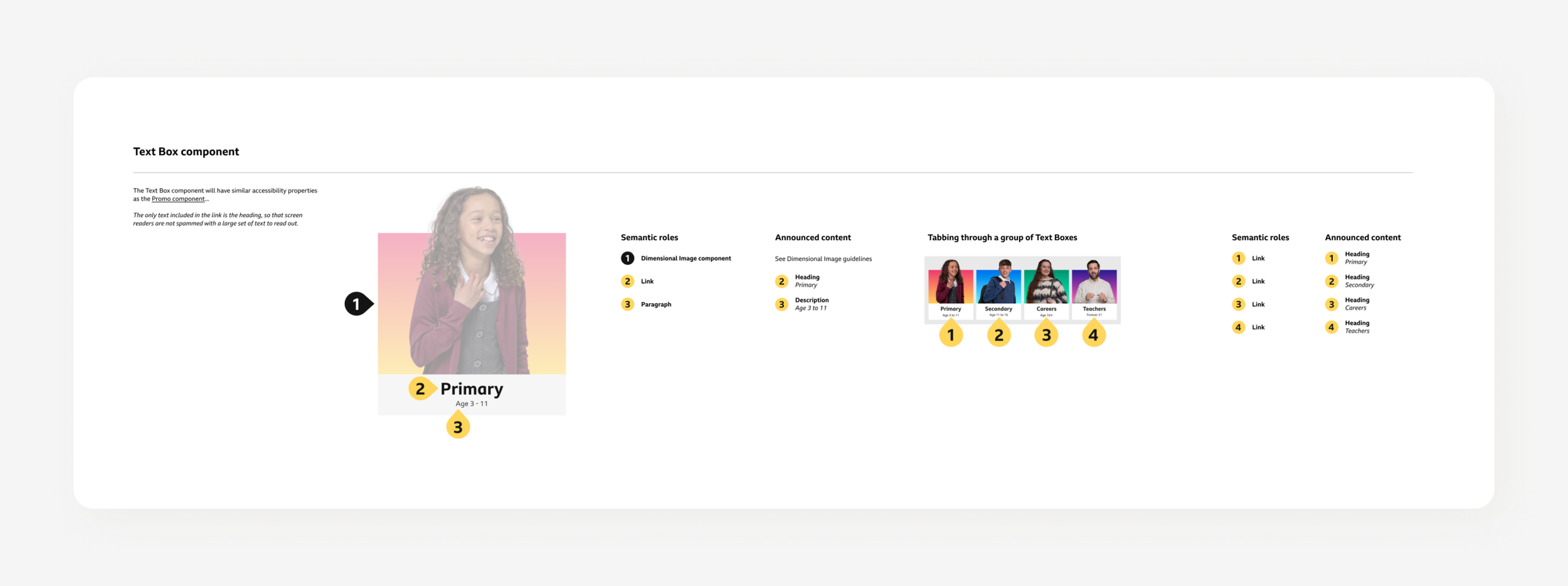
I collaborated closely with other teams to ensure the ‘dimensional image’ UI component met design system and accessibility standards before seeking sign-off at all levels. I then paired with a developer to ensure the build of the component was to specification before working with our Test lead to conduct an accessibility swarm.

Art direction document shared with Marketing colleagues to ensure the photography met both the user & brand expectations

Screen reader mark-up for the design of the new ‘dimensional image’ UI component
Outcomes
This project became a success as we took the business need of rebranding and through user research enabled it to remain relevant to our audience. This user first approach guided us through every process keeping stakeholders focused on the right things.
A relevant experience
Research & user feedback informed designs and the evolution of the rebrand. Helping to maintain user value and relevance.
Improved product performance
Improved page loading and accessibility gained from migration would provide users with a quick, trusted service.
A brighter present & future
Using the BBC design system provides Bitesize with access to a broader range of UI components, not only today but also in the future. Enabling Editorial teams to be responsive to changing users needs.

Bitesize’s rebranded desktop homepage
Metrics
Having conducted the brand perception research and remaining user centric though out. We were confident the rebrand would be well received by users, the only true metric that would reflect this would be traffic to popular journeys.
+2%
Increase to key ‘phase’ curriculum journeys;
users have found the route to curriculum content via the homepage easier since the rebrand launched.
+20%
Increase in page performance & accessibility; provided users with quicker page loading, less errors and a higher standard of accessibility.
Reflections
From the start this project required stakeholder management at multiple levels with colleagues from different departments across the BBC, my presentation and communication skills were key to ensuring I delivered the right messages to the right people.
User research in Discovery phase
Conducting research at the right point in the project allowed us to remain user centric throughout the process.
User advocacy & generating buy-in
Again, being user centric from the beginning allowed for less friction & delays when faced with subjectivity regarding design decisions.
Documenting design decisions
A lack of documentation around release strategy and ‘musts’ resulted in confusion and delays within Agile teams.
Want to see more?
This case study is simply a snapshot of the work. If you would like to hear more about my processes, thinking and the challenges, please get in touch.


